iPhone X review: The best damn product Apple has ever made 290
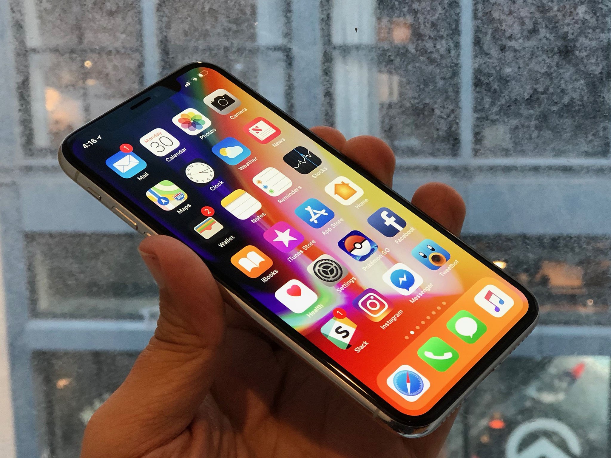
For over a decade, iPhone has embodied modern mobile computing. iPhone 8, launched last month, is the culmination of that Home-button-and-bezel vision, of everything that's come before. iPhone X (pronounced "Ten"), launching now, is something else entirely — the beginning of what comes next.
The two phones have many things in common, including the A11 Bionic processor inside, inductive charging on the back, along with Portrait Mode and Portrait Lighting on the rear camera system. Both are water resistant, have the same high-speed wireless radios, and 64 GB and 256 GB storage options.
What iPhone X doesn't have — aside from a gold color option — is a Home button, Touch ID, and bezels. Apple has deleted all of them. And, in their place, created new, gesture-based navigation, Face ID, and the TrueDepth camera system.
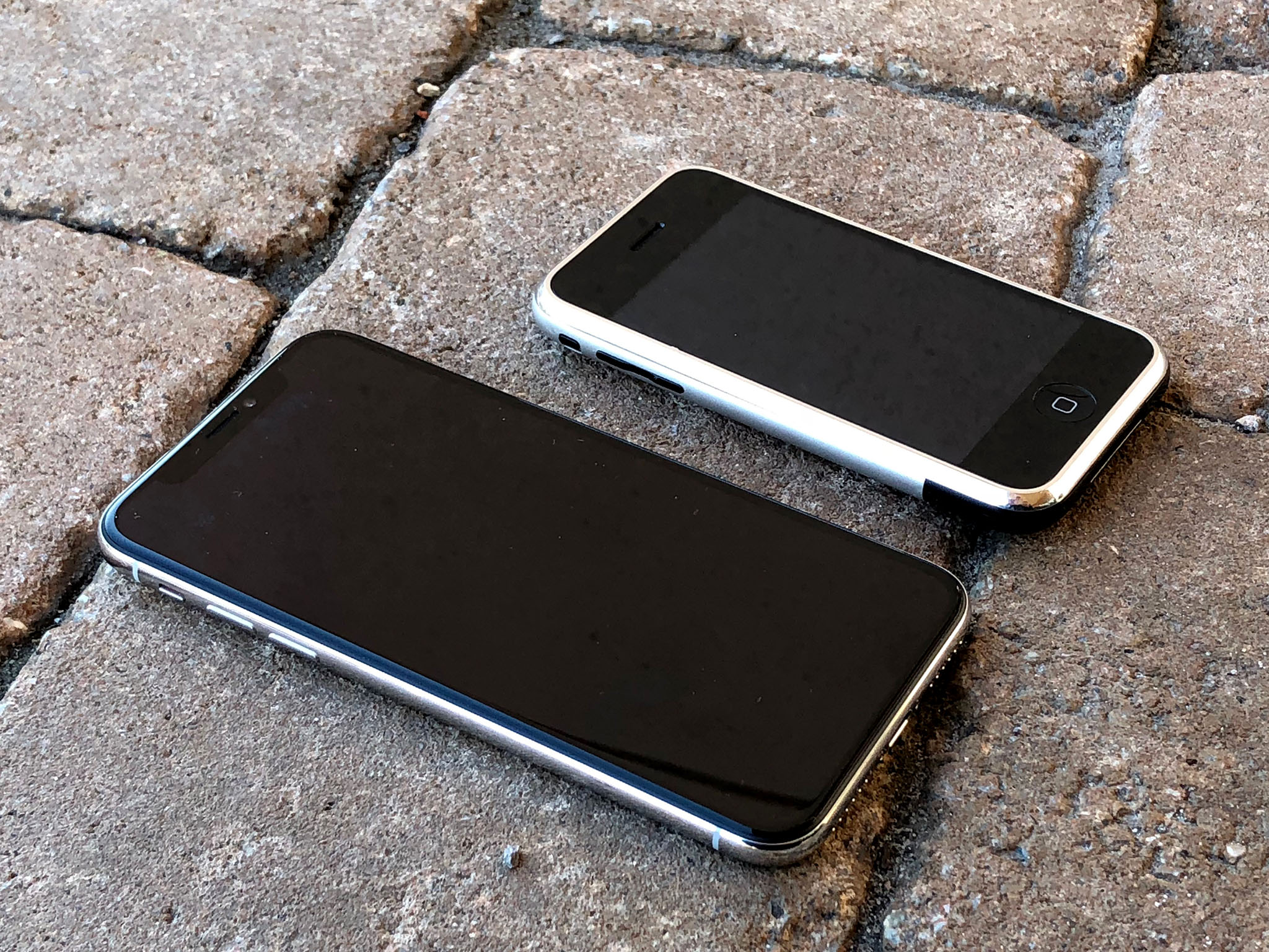
The result is a display that goes edge-to-rounded-edge, wrapped in a design that harkens back to the original iPhone while still looking like something straight out of sci-fi. Starting at $999.
So, is iPhone X — wait. Stop the review and rewind that. I can't stick to being purely analytical with this one.
I've now spent a week with iPhone X as my primary device. So far, it's the most fun I've had with any gadget since the original iPhone. I'm not being hyperbolic here. There are shortcomings. There are things I'd love to see changed. But I can't stop using it. The new display is beyond gorgeous. HDR is glorious. Fluid navigation gestures are sublime. Face ID is so fast I'm forgetting I have a passcode. Attention aware interactivity is the bomb.
I'll still walk you through all the little details and give you a ton of #protips. I'll still share plenty of gripes. And I'll update this review throughout the next week and month. But know that I'm going to be smiling the whole time. Because iPhone X might just be the best damn product Apple has ever made.
Prefer to listen rather than read? Hit play on the podcast version:
iPhone X in Brief
For people who want:
- Edge-to-edge design.
- Optically stabilized ƒ/1.8 and ƒ/2.4 dual-lens rear camera.
- Depth-aware front-facing camera.
- Face detection biometrics.
- Tomorrow's iPhone today.
Not for people who want:
- Classic iPhone design.
- Home button.
- Fingerprint identity biometrics.
- Gold or other color options.
- Lower pricing.
If you want a familiar iPhone experience, iPhone 8 is ready and waiting for you. If you want a radical new design, with as close to an edge-to-edge OLED display as possible, a TrueDepth camera and Face ID on the front and an even-better-than-iPhone-8 dual camera system on the back, and you have the cash for it, then get iPhone X and enjoy not only tomorrow's iPhone today, but the best damn product Apple's ever made. And that's saying a lot.
iPhone X Video
If you don't have time to read everything right now, watch the video below and get all the highlights you need to know.
iPhone X 'Design'
Like iPhone 4 before it, iPhone X is glass front and back, and better-than surgical-grade stainless steel around the edges. These edges, though, are rounded instead of abrupt, making it harder to tell where one material ends and the other begins.
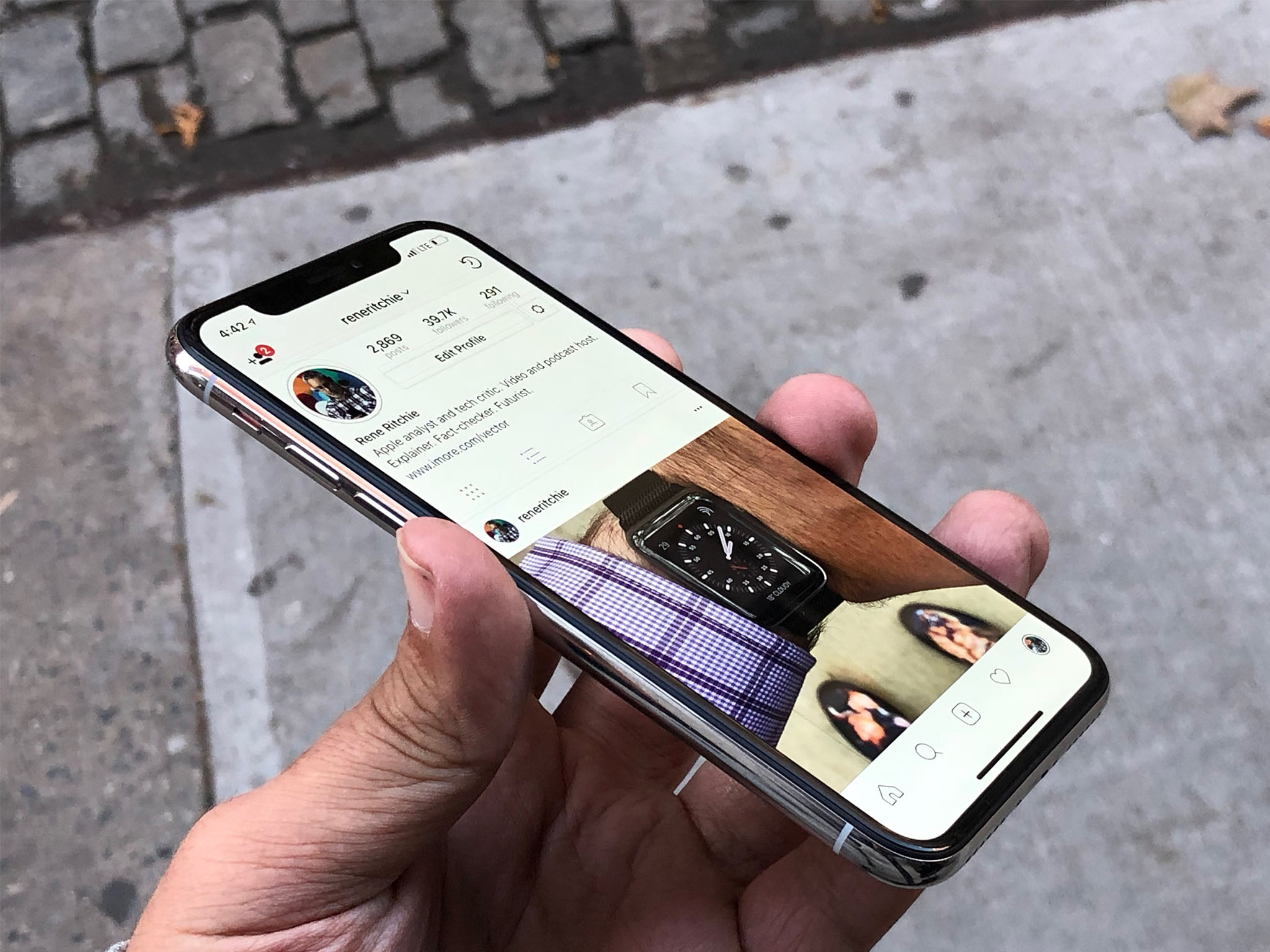
The glass is the same as iPhone 8, made in close collaboration with Corning and engineered to be the toughest out there. There's no gold, rose or otherwise, option for iPhone X, but you can get it in a pearlescent white or stealthy space gray. It's also a tad slippery, like iPhone 8. If you're used to putting your iPhone down on armrests and other sloping services, either stop doing that or get a case. Glass is glass.
The stainless steel is shiny, shiny steel on the white version, reminiscent of the original iPhone, or vapor coated dark on the space gray version, similar though not identical to the DLC coating on the space black Apple Watch. There are antenna lines on the band, though they're not pronounced, and an Apple logo and the word 'iPhone' on the back. The glass and steel are microscopically sealed, so you get the same kind of protection from liquid and dust ingress — water resistance — as the last couple of iPhones. In other words, if it gets splashed or dunked, you're probably fine. If you go shark diving with it, you'll eventually have problems.
The stereo speakers on the top and bottom are louder now — Apple says upwards of 35% — and deliver a deeper bass. Playing music, podcasts, and calls through them, like an animal, all sounds fine.
None of that really matters, though. iPhone X's design is completely dominated by an expansive OLED display that measures 5.8-inch corner-to-corner. At least it would if iPhone X had corners. Apple has rounded them off, aggressively. Still, it allows Apple to fit an iPhone Plus-sized display into a regular iPhone-sized chassis. And that's important because when people complain about the size of a phone, it's not really the screen size they're talking about. It's the overall size.
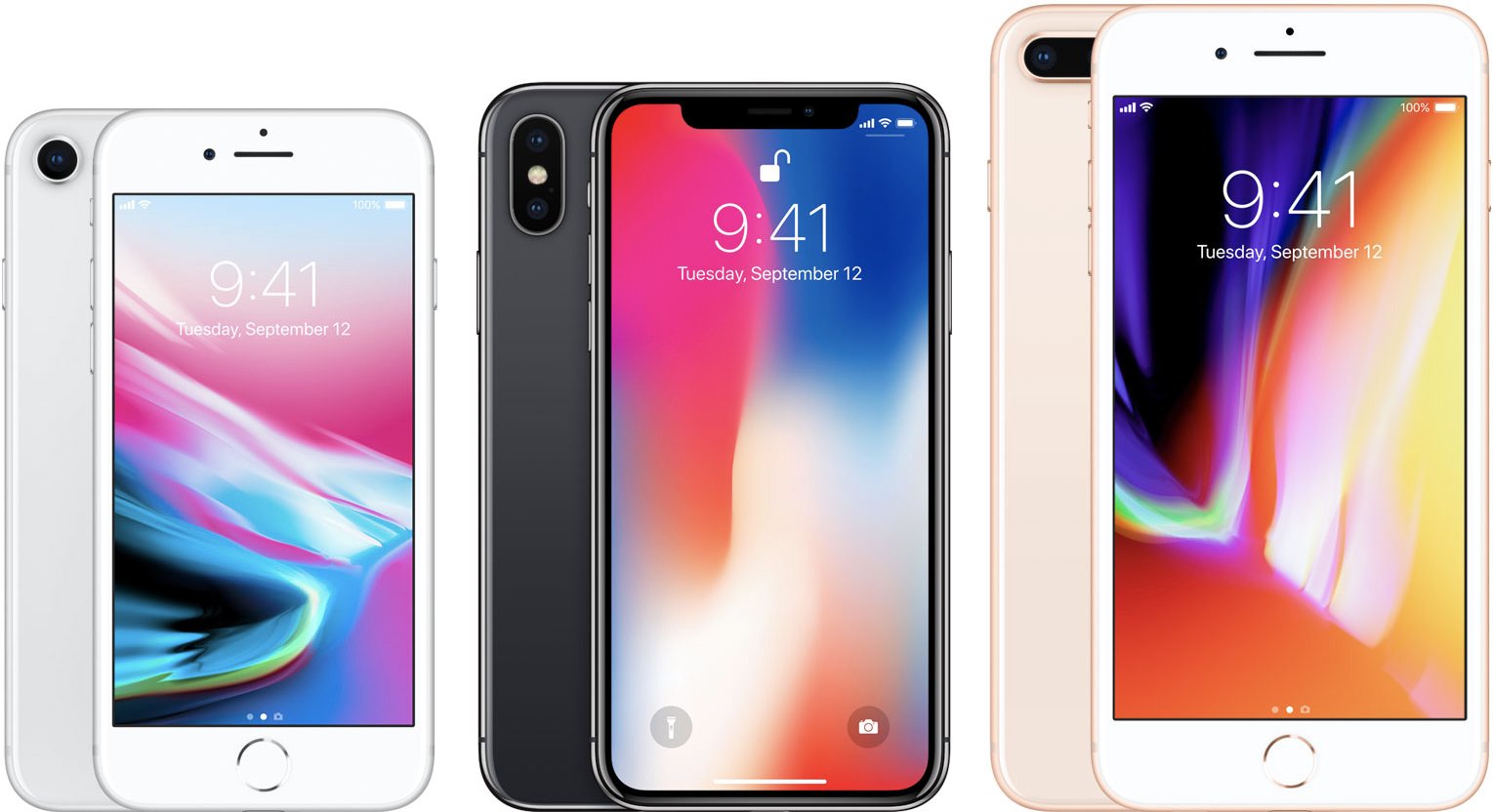
Taking it on — and off — the chin: iPhone 8 (left) vs. iPhone X (center) vs. iPhone 8 Plus (right) display and bezel sizes.
The display really is edge-to-rounded-edge and manages to run completely across the glass and into the stainless steel band around the sides. That is, except for the big bite Apple took out of it at the top. The look has been popularly referred to as a "notch" or, internally and casually, as "forehead" and "ears". For some, it was and will forever be the "horns" (as in🤘).
In a perfect world, I'm sure Apple would have loved to have been able to create a truly edge-to-edge display, top and bottom. Since the TrueDepth camera system can't currently be hidden beneath the panel, the company was left with two choices: Give up on edge-to-edge altogether and run the TrueDepth camera module all the way across the top, or keep edge-to-edge at the rounded corners and let the TrueDepth camera system bite into the top. Apple chose the latter. And then spent significant time and effort engineering it.
It would have been much, much easier to go with a full bezel on top, either with actual atoms or by filling them in with black colored pixels.

Not so edgy: iPhone X with a full hardware bezel (left), faux software bezel (center), and the horns (right).
But both of those choices would have made iPhone X look like every other big screen display on the market. And it would have made for a more distracting blob on the side of the screen when using it for augmented reality (AR).

Who's the fullest of them all: iPhone X (left) vs. the bigger bezels of Samsung (center) and LG (right)
So, Apple chose to showcase the horns. To own them. To spend all that silicon and display budget to carve, curve, and fill them, and make them the most visually distinct design element of iPhone X. So distinct that, with the Home button gone, the horns are now the most immediately recognizable thing about iPhone X. The thing that has replaced the Home button in icons.
It's easy to disagree with that choice. At first glance, the horns look awkward and distracting. At second and third glance as well. Like a spot in the corner of your eye or a splinter in your mind.

Landscaped: iPhone X defaults to widescreen for video but you can double tap to go full screen, horns and all.
There's also a functional cost: Status bar icons have been pushed into the horns, which is great in terms of peripheral data display efficiency. It's like putting complications in the corners of Apple Watch. But not as many icons can fit in there, so Apple has reduced the amount.
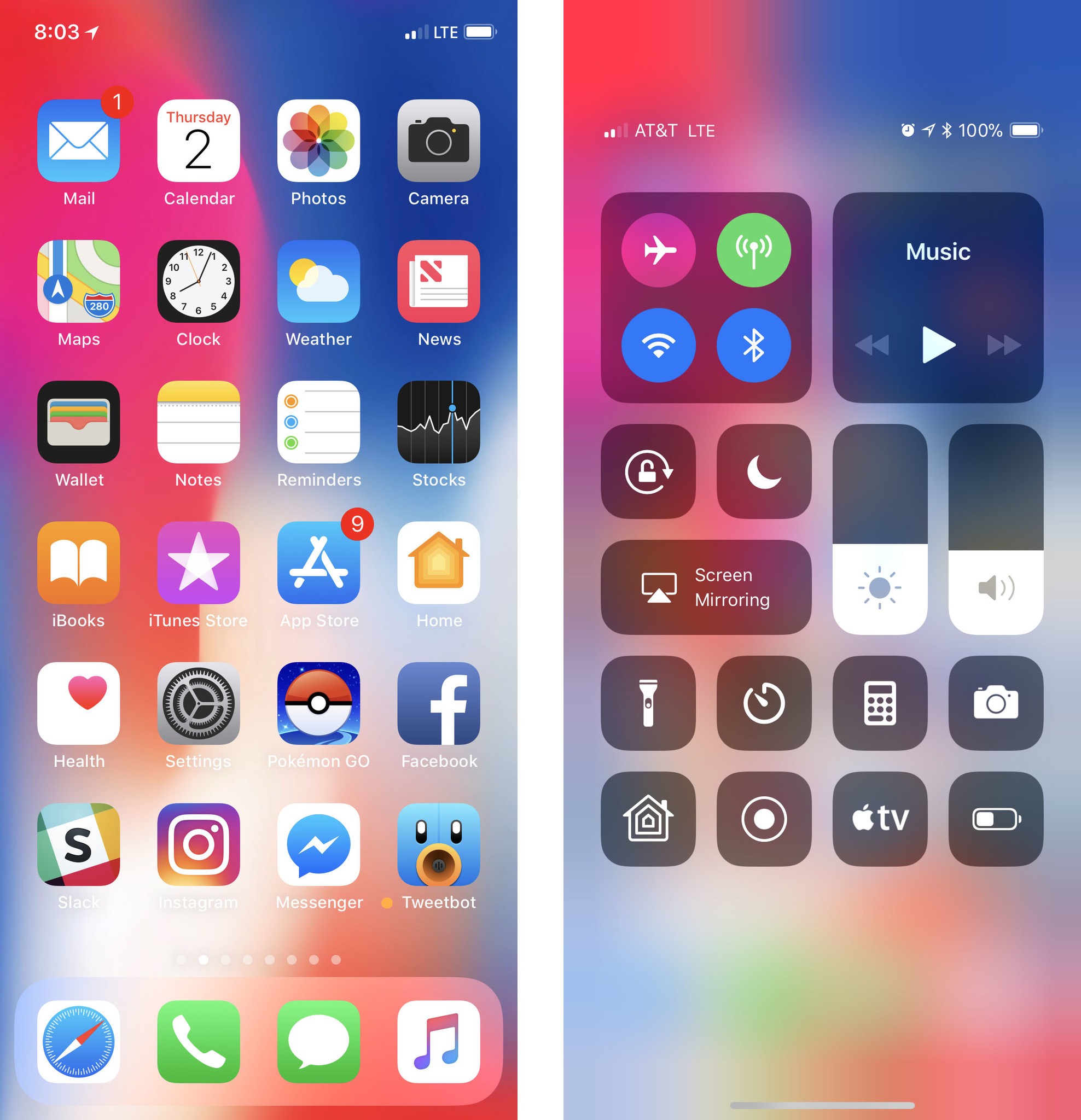
Time has moved from center to hard left and it's joined there by the location services indicator. Cellular signal strength, networking type (Wi-Fi, tethered, LTE, 3G, etc.), and battery indicator are hard right.
To see anything and everything else, including alarm, VPN, and even Battery Percentage, you have to swipe down for Control Center. That will give you your full set of status icons.
I'm not sure how I feel about this yet. Having persistent, glanceable icons is absolutely an advantage. But, long ago, I turned off 90% of my notifications and have lived a better life ever since. Will the same prove true with battery percentage — will it lead to less stress or just learned helplessness? I'll give it a week and see.
Meanwhile, I'll keep pulling down Control Center every too often.
Back to the aesthetic. Subjectively, a lot of people at Apple who've been using iPhone X for an extended period of time seem to genuinely love them. But do they love them because they're truly great or simply because they're distinctively Apple? A lot of people on Twitter who have never used iPhone X seem not to. But do they not love them because they're bad or simply because they're unlike anything that's come before?
After having spent some time with the horns, I'm already beginning to forget about them. I can instantly see them if I look for them, of course. And on a white screen like web pages, they stick out more than on more color-filled and darker screens. in landscape it looks even odder at first, but I end up putting my thumb over the camera module anyway, so it's always at least partially obscured.
I'd still rather the horns disappear but only when and if Apple can go truly edge to edge. And I'm not sure how long that will take.
Famously, under Steve Jobs, Apple released a wide-bodied iPod nano and an iPod shuffle without buttons. Both were rolled back after just a year. That's the cost of trying new things and I'm glad Apple is willing to risk it, even on its most popular products.
Will the horns age better? For now, they're a curious experiment in expansive display and peripheral data presentation. How they're received by millions of customers will determine if their distinctiveness is quickly rolled back or if it becomes truly iconic.
My strong hunch is the latter.
iPhone X OLED Display
iPhone X is the first iPhone with an OLED display. OLED — organic light emitting diode — has several advantages over the LCD technology Apple used in every previous iPhone. For example, the pixels emit their own light so there's no need for a separate backlight the way there is on LCD. That allows for thinner displays and, because only the pixels that need to be lit are lit, deep, inky blacks.
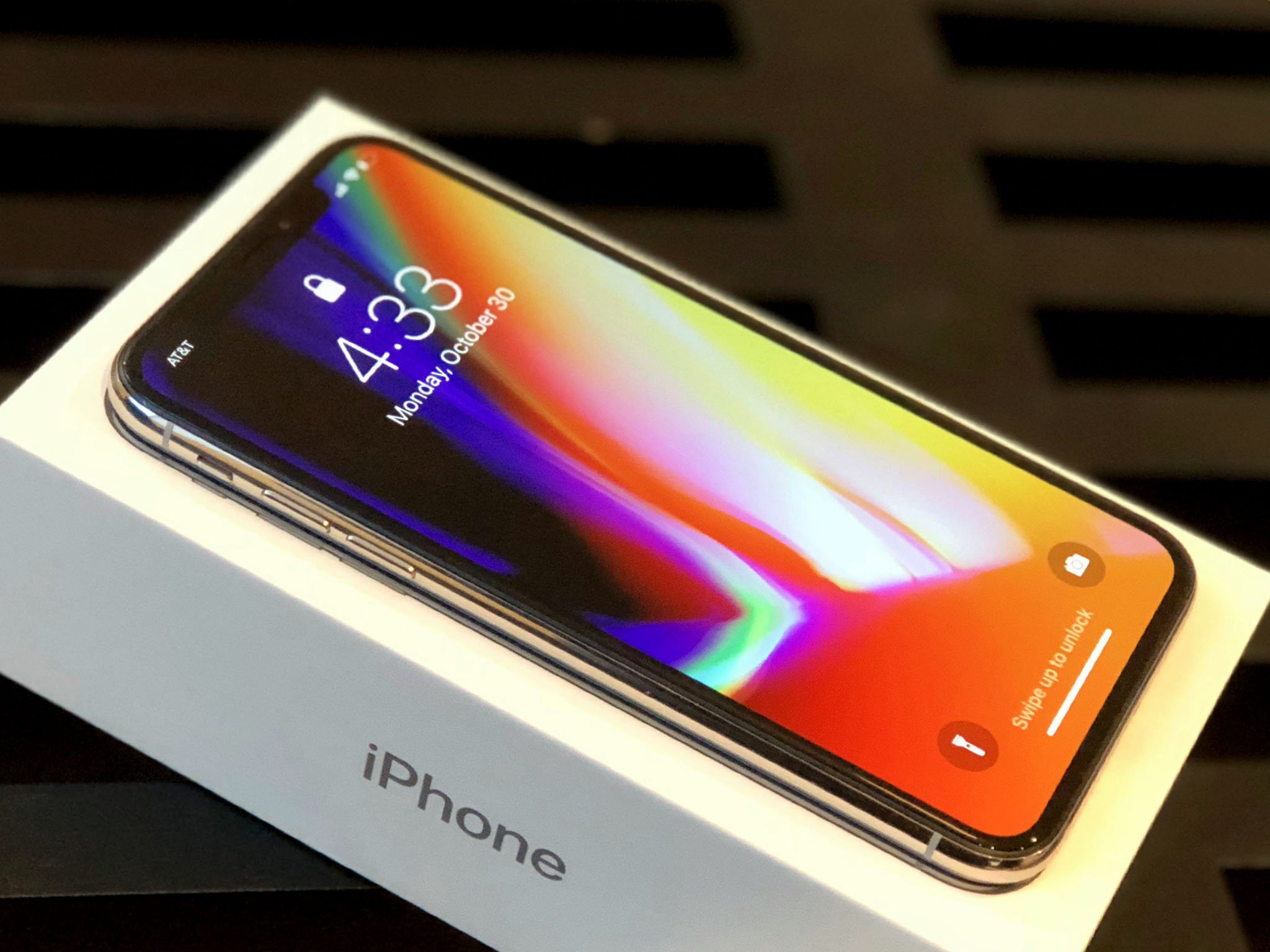
Apple has used OLED before on Apple Watch and on MacBook Pro's Touch Bar. iPhone is different, though. The display on an iPhone is bigger, denser, and is used in far more ways and far more often.
Apple has also consistently delivered the best LCD panels in the business and can't afford to take a step back when the company should be leaping forward.
But that's the double-edged sword of OLED. It's not as mature a technology as LCD every advantage it offers comes with considerable challenges. Just look at Google's brand new Pixel 2 XL shows what happens when you get OLED wrong, which has seen its OLED display widely panned for poor color calibration, off-axis color shifting, graininess, and almost immediate burn-in.
To begin with, Apple has sourced its OLED panels from Samsung Display, which offers the best and most mature phone solution currently on the market. (Pixel 2 XL was sourced from LG Display.)
That does mean the iPhone X is stuck with a diamond pixel arrangement, which has oval green pixels with square red and blue pixels arranged around them, rather than the RGB stripe traditionally used for LCD displays. It's a way to mitigate against the significantly lower lifespan of blue pixels in OLED, and it's what can currently be supplied at scale.
To make the diamond arrangement look as good as possible, Apple is applying its own subpixel anti-aliasing. It's effective enough that, after leaving the iPhone X hands-on area after Apple's September event, almost no one seems to have noticed the difference in pixel layout. Even now, staring at it, it looks great. Maybe under a macro you could see the difference but to my naked eye, Apple nailed the pixels.
Diamonds are for OLED: iPhone 8 Plus with it's traditional RGB stripe pixel arrangement (left) and iPhone X with its diamond PenTile pixel arrangement (right).
Apple is also individually calibrating every iPhone X before it leaves the factory. That's not something most vendors do. (Some barely sample at all, others only a few per batch.) It's something Apple's been calibrating that way since it moved to DCI-P3 cinematic color gamut a couple of years ago.
Combined with Apple's system-level color management, it means the display won't look oddly blue or green, and some iPhone X won't look cooler or warmer than others. They won't look washed out and dull like Pixel 2 XL or oversaturated like Samsung Galaxy S8. They'll all, every single one of them, look exactly the way nature and Apple intended — like an iPhone.
OLED showdown: iPhone X (left) isn't as over-saturated as Galaxy Note 8 (middle) or as washed-out as Pixel 2 XL (right).
So, all the apps and games you're used to using will look just like you're used to them looking, especially if you're coming from an existing DCI-P3 iPhone 7 or iPhone 8 with their deep reds and vibrant greens.
It's something you may not appreciate unless and until you hold iPhone X up to other displays. But when you do, you'll never unsee it. (What good is color management if you don't have color calibrated displays anyway?)
Because of the precise color calibration and system-wide color management, Apple is also able to bring TrueTone to iPhone X. TrueTone uses a multi-element ambient light sensor to continuously measure the color temperature around you and adjust the display to match. That way, whites don't look cool blue or warm yellow. They look white. Like paper white. I turned it on immediately and I'm not turning it off.
That's not to say everything is perfect. Apple has done a great job preventing some of the color shifting that occurs when you look at OLED displays. On angle, at lower brightness and with TrueTone on, iPhone X looks slightly redder and warmer to me. Not so at full brightness and with TrueTone off.
Off-angle, Apple has done a good job preventing red shift but not so much blue. It's cool and it's uniform rather than splotching in from the corner. But it's there.
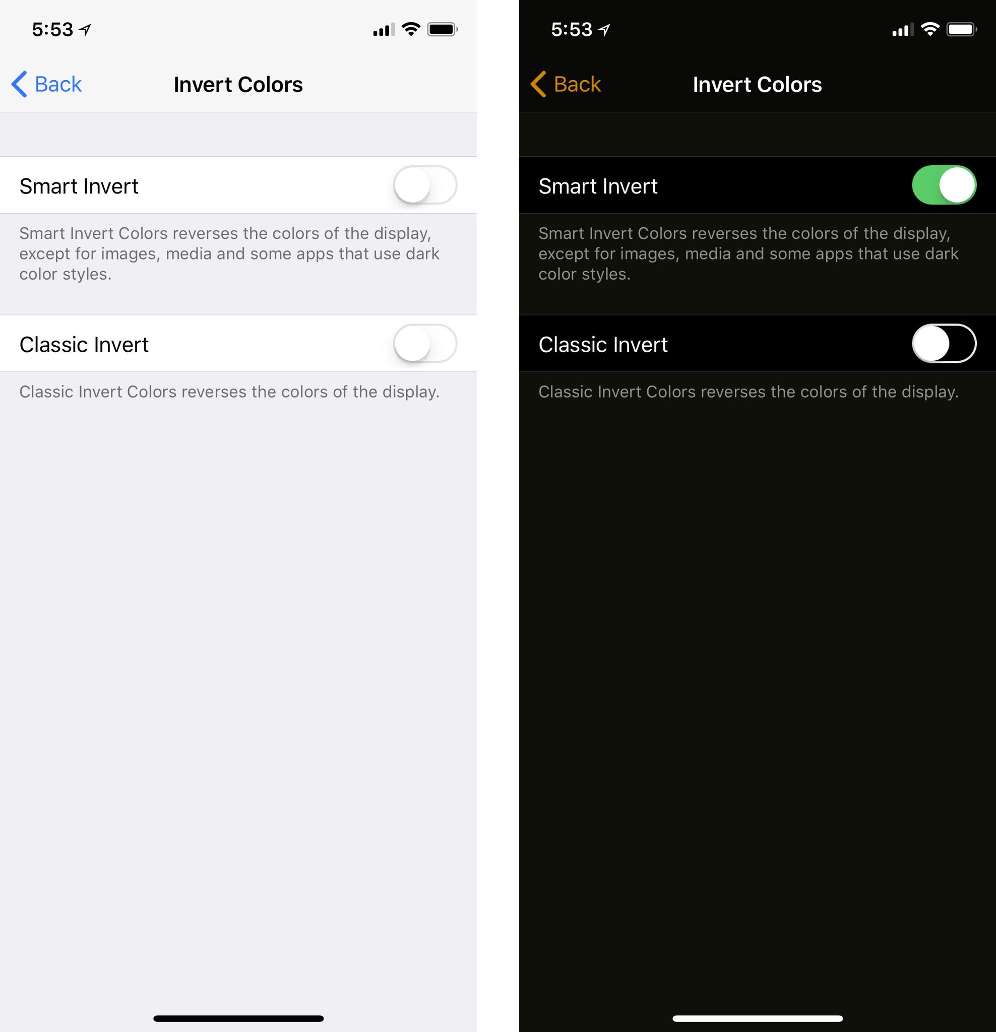
What's not there is a dark theme. Still. OLED is more power efficient when it comes to displaying black but less efficient for white. Since iPhone has Safari and most web pages are white, there aren't the same opportunities to force black interface as there are with Apple Watch (which has higher power constraints and lacks any web access.) You can use Smart Invert in Accessibility if you really want a dark theme, though.
Burn-in, which is also an issue with OLED, will take longer to review. My understanding is that Apple's display team has gone above and beyond to prevent it with both constant and over-time mitigations. I'd love to know exactly what they're doing but they're not giving out any details, at least not yet. Either way, we'll have to wait and see how well it does.
For all of these challenges, OLED also brings significant advantages. Because it doesn't require a separate backlight, it's thinner and allows for real blacks and an impressive 1,000,000:1 contrast ratio. It also allows for much higher brightness levels.
What Apple's display team has managed to produce is beyond impressive. They're calling it the first OLED good enough for iPhone and, while there are individual elements like the off-angle blue shift I can quibble with, overall it's tough to argue with them.
Now, you're going to hear a lot of people claim every good thing about the iPhone X display is due to its sourcing. That's straight up bullshit. Even though Apple has never manufactured its own panels — at least not yet — for years the display team has engineered magic from its components and shipped the best large-scale LCD in the industry. I'll wait until the display nerds get their instruments on it to say this unequivocally, but I wouldn't be surprised if Apple had just done the same with OLED.
And I haven't even gotten to the best part yet.
iPhone X HDR
I'm going to keep repeating this until it really sinks in: Virtual Reality (VR) aside, HDR is more important than 4K. I've been to Dolby Labs. I've sat through the Star Wars 1080p HDR vs. 4K SDR demos. I've spoken to many experts. I know this to be true. And iPhone X is the first end-to-end HDR — high dynamic range — device not just from Apple but, as far as I can tell, the first period.
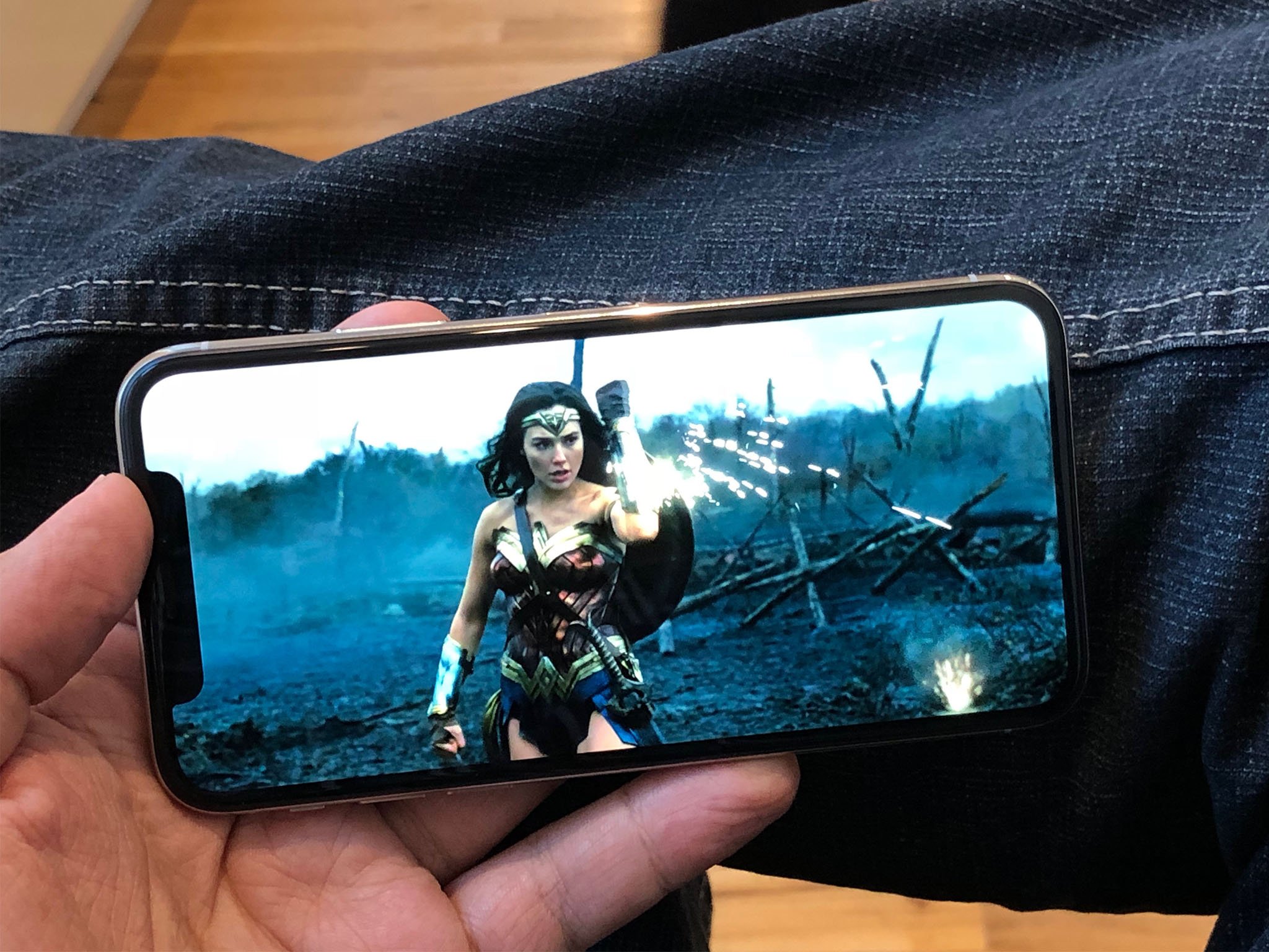
It's great to see all the HDR photos you've been taking for years finally rendered in real HDR. But it's even better for video.
Many of Apple's recent devices, including A10 iPads Pro, A10 and A11 iPhones 7 and 8, and Kaby Lake Macs, can handle a full 10-bit HEVC (H.265 4K HDR) pipeline but have LCD displays that can't really show it off to full effect. Some of Apple's competitors have the right displays but they lack the pipelines needed to get HDR to those displays.
iPhone X has both — everything needed to handle and output full HDR in all its glory, including support for HDR10 and Dolby Vision.
That includes the deep, vibrant colors of properly calibrated and managed DCI-P3 and the exquisite details in shadows and highlights made possible by HDR.
You may not think wide gamut, high dynamic range would be impressive on a phone but it really is. Especially at the distance you typically hold a phone. 5.8-inches at 10-inches can be every bit as immersive as 65-inches at 10 feet. More, even.
Apple is already making a good amount of content available in HDR through the iTunes Store and it looks terrific on iPhone X. It's every bit as powerful as it is on Apple TV 4K, where you see colors and textures you never realized existed before. And with iPhone X, you can hold it in your hand. Netflix, Amazon, and others should also be updated for HDR on iPhone.
For me, all of what Apple's been doing for the last few years, from silicon to panel, has come together into this: The biggest visual leap forward since Retina display.
iPhone X Fluid Navigation
The Home button is dead. Long live the Home indicator!
For a decade the Home button was the center of iPhone navigation. No matter where you were or what you were doing, clicking Home once or twice would bring you exactly where it says it will — Home. Depending on how often or how long you clicked it, the Home button would also do a number of other highly useful things for you, from summoning Siri or Apple Pay to bringing up the app switcher or accessibility menu. It was our escape hatch and convenience key all in one. And now, with iPhone X, it's gone.
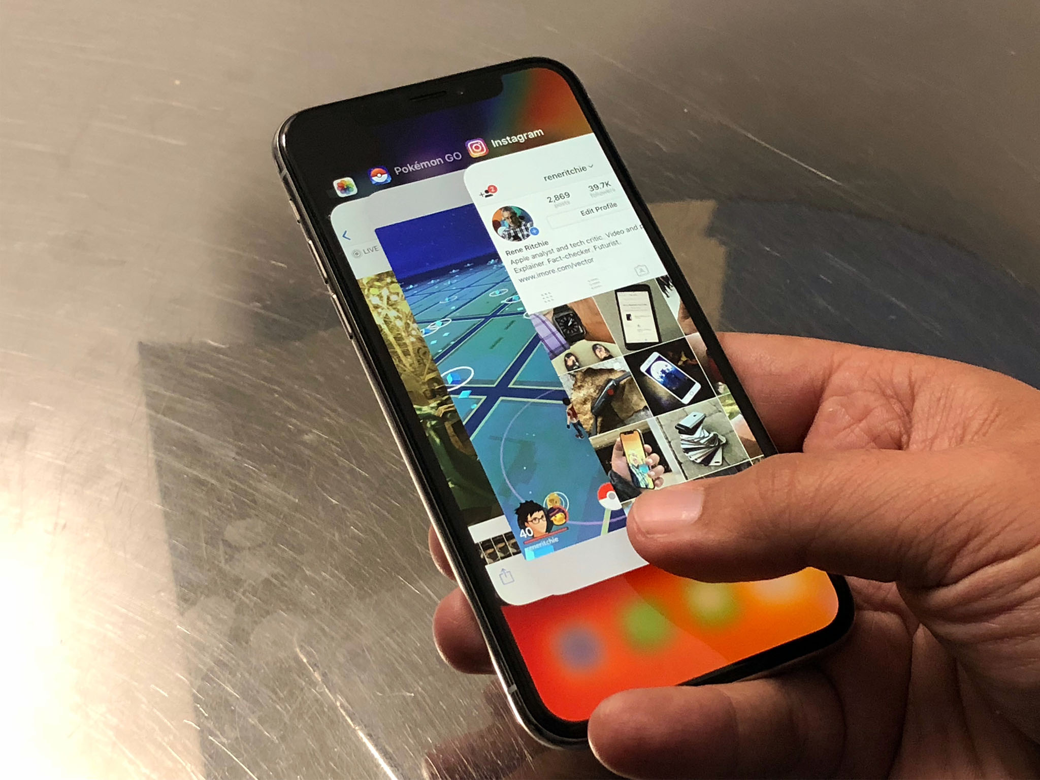
To make room for that edge-to-edge display and in recognition that, a decade later, our training wheels can come off, Apple has replaced the Home button with line called the Home indicator and a fluid, gesture-based navigation area. And it's magnificently fun.
Here's how it works:
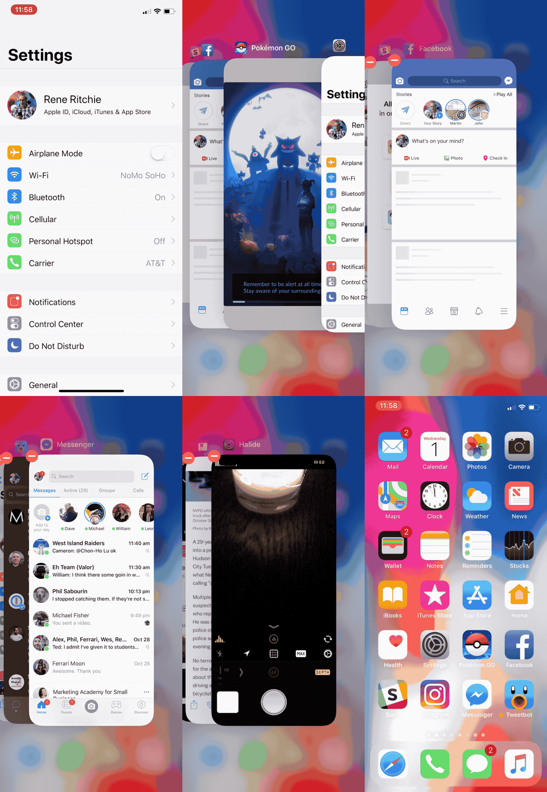
- Open/Home: Flick up from the Home indicator and let go immediately.
- Switch apps: Swipe left along the Home indicator to go back to the previous app, swipe right to return to the next app.
- Multitasking: Swipe up from the Home indicator and pause briefly before letting go to bring up the card view. Swipe left or right to switch between apps. (Don't overdo it, it's designed for speed. Literally just push up, pause, and lift your finger off.)
- Quit: Swipe up to multitask. Touch and hold a card. Either flick away or tap the ⛔️ icon at the top of the card you want to kill. (The ⛔️ icons position themselves so you can tap, tap, tap away apps really fast — even though you should never tap away apps.)
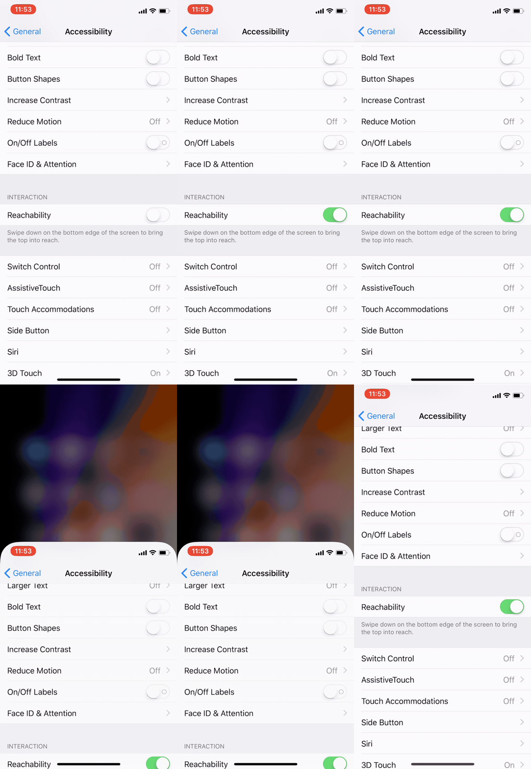
- Reachability: Swipe down from the Home indicator to enter reachability mode. (You need to enable it first in Settings.)
Because a swipe up now invokes the fast app switcher, Control Center had to move. And moving Control Center then meant Notification Center had to learn to share.
- Notification Center: Swipe down over the left horn or TrueDepth camera.
- Control Center: Swipe down over the right horn.
Here's where the horns come in handy. Had Apple simply split a flat edge gesture between the two, I think I'd hate it. Because the right horn gives you a precise target location for Control Center, though, it just works.
You have to be super careful with gestures. There are only so many simple gestures available and it's incredibly frustrating when they collide. (See iOS 10 volume slider on Control Center sliding panes for an example.) And most humans don't do well with more complex gestures, especially as they approach scribing out abstract incantations, Dr. Strange style. So, Notification Center top left and middle, Control Center top right.
In a perfect world, I wouldn't even need to use Control Center much. Siri would handle the vast majority of my environmental adjustments. But since Siri still can't even be bothered to turn the Flashlight on and off for me, I struggle on.
(There is a Flashlight shortcut on the Lock Screen, opposite the Camera shortcut. It's not customizable and it's restricted to the Lock Screen, but it's handy enough when you just want to pick up your iPhone and light up your path.)
As fun as the gestures are, there are also some frustrations. The gesture area itself is at the very bottom of the display, which isn't always comfortable to reach. Some apps overlay it, which makes it harder to use or causes collisions. Other apps sit so high above it looks ridiculously big and wastes a lot of valuable screen real-estate. Hopefully, as Apple and developers get used to the new gestures, the interface will tighten up.
Not every function of the old Home button has been moved to the new gesture area. Many of them have been moved to the new, longer Side button instead:
- Wake: Click Side button once.
- Siri: Click and hold Side button.
- Off/SOS: Click and hold Side button and either Volume button. (Just squeeze.)
- Disable Face ID: When the screen is off, click and hold Side button and either Volume button. (Just squeeze.)
- Apple Pay: Click Side button twice.
- Accessibility: Click Side button three times. (If enabled in Settings.)
- Screenshot: Click Side button and Volume Up.
- Reset: Click Volume Up, Volume Down, then click and hold Side button.
Yes, the complexity is quickly rising to the level of Konami code. In practice, my existing Side button habits from previous iPhones have persisted and I've been able to shift my Home button habits over (and up) fairly easily.
It did take some thought at the beginning. Similar to what it takes me with iPad, since Apple's ID team continues to troll us with a top mounted on/off button on those devices — something I only ever remember after pressing Volume first once or twice. At least.
Once you start to internalize all the changes, especially the the fluid navigation, it's not only intuitive but it's so much fun.
Apple is boosting the touch response to 120 Hz any time your finger hits the screen. It makes the interface feel immediately responsive — as though it's glued to your fingertip. It's not ProMotion — that also involves refresh rate and Apple's only using it on bigger, more power-hungry displays right now — but it's still sublime.
iPhone X Face ID
Face ID is Apple's new facial identity scanner. It replaces Touch ID, Apple's half-decade old fingerprint identity scanner, on iPhone X. It attempts to solve the same problem: How to make accessing a secure device faster and more convenient. Touch ID was only ever one of several potential solutions to that problem. Face ID is another. And it's one that has a few downsides but also a significant upside.

Face ID works similarly to how Touch ID works but instead of a sensor in the Home button it uses the new TrueDepth camera system on the front of iPhone X. When you first register with Face ID, the TrueDepth camera system takes infrared images of your face. Just like you had to move your finger around for Touch ID, you have to move your face around for Face ID. That way the camera system can capture you from a variety of angles and create a depth map of your face.
The resulting data is then sent to the secure enclave where a protected portion of the A11 Bionic chipset's Neural Engine Block transforms it into math.
Here's where there's a difference between Touch ID and Face ID: Touch ID throws away the original enrollment images of your fingerprints almost immediately. Face ID keeps the original enrollment images of your face (but crops them as tightly as possible so as not to store background information). That's for convenience. Apple wants to be able to update the neural networks for Face ID without you having to re-register your face each time. This way, the original data can automatically be applied to the new networks and you can simply keep on unlocking your iPhone X.

Like Touch ID, Face ID data is only available within the secure enclave, never leaves the device, is never sent to Apple, and is never included in backups or stored on any servers anywhere.
Once you've registered with Face ID, and you go to unlock, attention detection makes sure your eyes are open and you're actively and deliberately looking at your device. This is to help avoid unintentional unlock. (It can be disabled for accessibility, if desired.)
A flood illuminator then makes sure there's enough infrared light to "see" your face, even in the dark, and the dot projector beams a contrasting matrix of over 30,000 points for the camera to map against. (To protect against both digital and physical spoofing attacks, the dot matrix is not uniformly the same.)
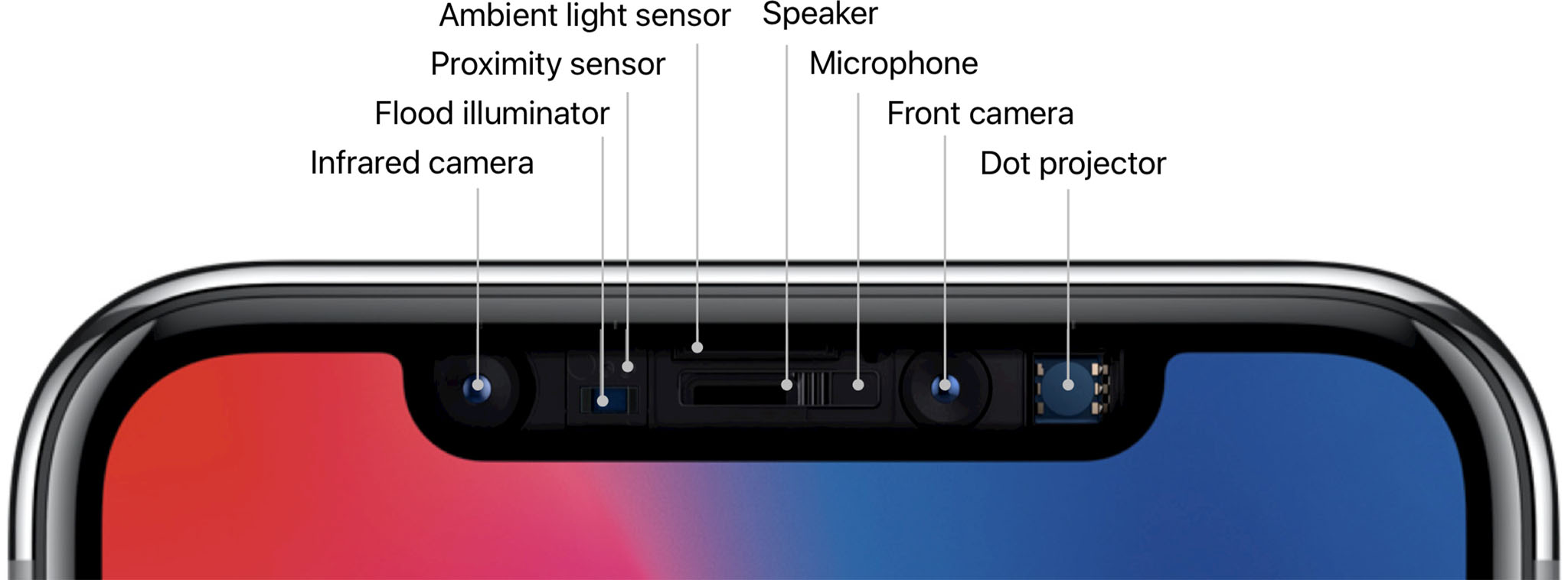
Next, the True Depth camera reads the data and captures a randomized sequence of 2D images and depth maps which are then digitally signed and send to the Secure Enclave for comparison. (Randomization also protects against spoofing attacks.)
The portion of the Neural Engine inside the Secure Enclave converts the captured data into math and the secure Face ID neural networks compare it with the math from the registered face. If the math matches, a "yes" token is released and you're on your way. If it doesn't, you need to try again, fall back to passcode, or stay locked out of the device.
The process is similar for Apple Pay, Apple Store and iTunes, and other purchases, but you double-click the side button first to signal your intent to authorize. (So you don't have to worry about, for example, making an accidental in-app purchase simply by looking at your iPhone.)
The secure neural networks were trained specifically for Face ID by using over a billion images, including infrared images and depth maps, that Apple collected during informed studies conducted around the world, with representative groups of people from a wide spectrum of origins and backgrounds.
A second secure neural network has also been trained specifically to defend against spoofing attacks. If you're worried about photos, videos, makeup, masks, maybe even plastic surgery being able to get into your Face ID, this neural network is your Batman.
None of the neural networks have yet been trained to distinguish multiple registered faces. They can tell you or not you, but not you, someone else, and not either of you. That's a level of complexity beyond the first iteration of the system. Right now, very few people reportedly register multiple fingers for Touch ID, but Apple could add that functionality to a future implementation of Face ID, if there's significant demand.
Face ID may also store, for a limited time, the math from successful unlock attempts and even from unsuccessful unlock attempts where you immediately followed up by entering the passcode. That's to help the system keep pace with changes to your face or look that might accrue over time, even the more dramatic ones. For example, if you change hairstyles, eyeglasses, or facial hair or decoration.
After it's used the data to augment a limited number of subsequent unlocks, Face ID discards the data and, potentially, repeats the augmentation cycle.
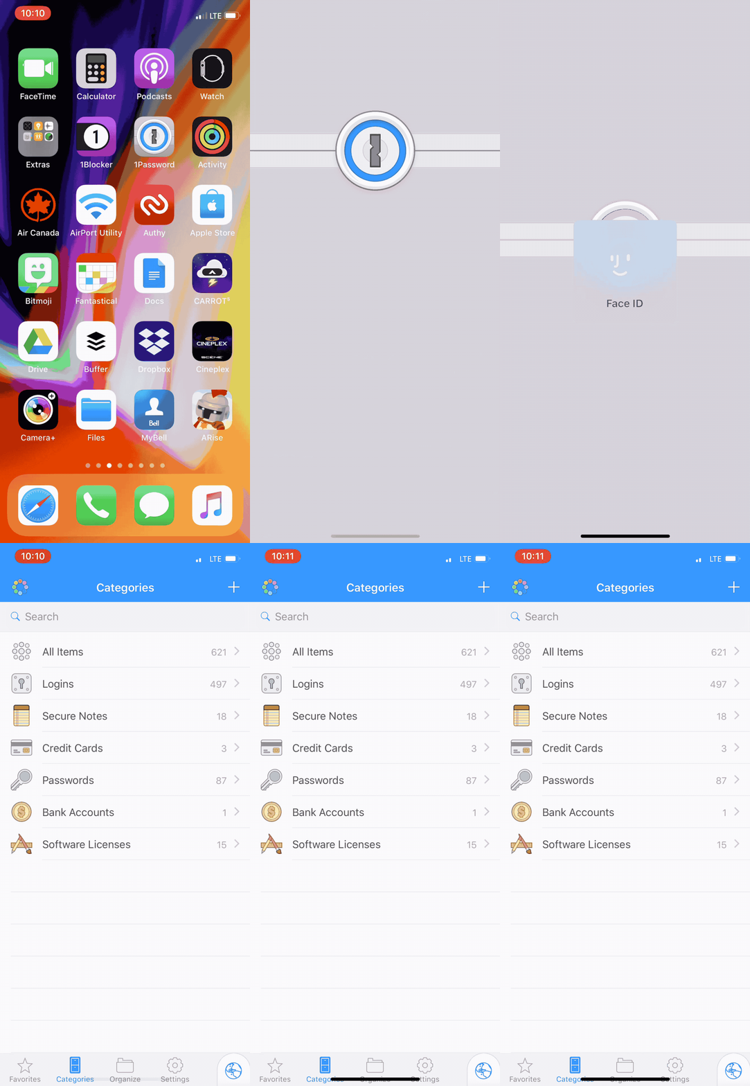
If you're worried about your existing banking, password, and other Touch ID apps, don't be. Apple doesn't have a Touch ID-specific framework. It has a biometric framework and the system will present Touch ID or Face ID depending on what's available on your device. So, while developers can add some customization like display text, everything should pretty much "just work".
What's more, for iCloud Keychain in Safari, Face ID can auto-fill passwords on auth. So, if you go to a website where you have an account, and that account is stored in iCloud Keychain, and you're looking at your iPhone X, the Face ID animation will pop up, your credentials will pop in, and you'll be on your way without lifting a finger or typing a character.
I was shocked the first time it happened. Then I couldn't stop smiling. It's the "master password" feature I've always wanted to see in iCloud Keychain. It means handing someone else my iPhone no longer means handing them my every login and credit card. I love it.
What neither websites nor developers can't do is get your face data. Just like apps never got access to your fingerprints with Touch ID, they never get access to your face data with Face ID.
Once the app asks for authentication, it hands off to the system, and all it ever gets back is that authentication or rejection. Apple has a separate system, built into ARKit, the company's augmented reality framework, that provides basic face tracking for Animoji or any apps that want to provide similar functionality, but it only gets rudimentary mesh and depth data, and never gets anywhere near Face ID data or the Face ID process.
Face ID is also like Touch ID in that there are several situations where it will lock down and require a passcode before it can be re-enabled. Those include:
- After a reboot.
- After a remote lock (for example, through Find my iPhone.)
- After SOS mode has been triggered (by holding down the side but and either volume button for 2 seconds.)
- After having been locked for more than 48 hours.
- After five failed attempts to match face data.
- If the passcode hasn't been used in the last 156 hours and Face ID hasn't been used in the last 4 hours.
Going into SOS mode is the absolute best way to prevent someone else from trying to use Face ID on you to unlock your phone. Intention detection is the subtler and more persistent way. If someone else takes your phone, turn your head and close your eyes. Then, just like they'd have to force your finger onto Touch ID, they'd have to force your eyes open for Face ID.
That should alleviate much of the fear, uncertainty, and doubt (FUD) being spread about Face ID making it easier for criminals or law enforcement to get into our devices.
For people who require higher levels of security, a strong password remains a better option than any biometric convenience on the market.
Face ID has a fairly wide field of vision so, depending on the exact angles, you can tap the screen to wake iPhone X, and be scanned by Face ID, under a variety of conditions. All it needs to do is be able to "see" the geometry of your eyes, nose, and mouth.
It doesn't matter if have your glasses on or off (though sunglasses that block infrared (IR) will also block Face ID). If you change your hairstyle or color. If you grow a mustache and/or beard and then shave them off. If you're wearing religious or climate-based facial coverings (though full-on Canadian-style ski masks and goggles might obscure too many points of identification to be useful — I look forward to testing that when I hit the slopes!)
There may be cases where too much changes at once and Face ID fails to recognize you. If/when that happens, the system will simply kick you back to Passcode, just like Touch ID does when the moisture level (or wetness) of your finger was different enough to prevent a scan.
For all of Apple's work on Face ID, though, there remain some real limitations:
- Face ID, as currently implemented, does not work in landscape orientation. (The camera system is optimized for portrait.)
- Face ID needs to be able to see your eyes, nose, and mouth to be able to function. If too much of that area is blocked by IR filters (like some sunglasses) or other objects (like masks), there's not enough of your face to ID. (This is like the gloved finger with Touch ID.)
- Direct sunlight on the Face ID camera can blind it, just like any camera. If you're standing with the sun directly over your shoulder, turn a bit before using Face ID. (This is like the moist finger with Touch ID.)
- If you're under the age of 13, your facial features may not yet be distinct enough for Face ID to function properly and you'll have to revert to passcode.
- Face ID can't effectively distinguish between identical twins (or triplets, etc.) If you have an identical sibling or even similar looking family member, and you want to keep them out of your iPhone X, you'll have to revert to passcode.
- If you give someone else your passcode, they can either delete and re-setup themselves on Face ID or, if they look similar to you, enter the passcode repeatedly at failure to retrain Face ID to recognize their features as well/instead.
- Unlike Touch ID, which allows for the registration of up to 5 fingers, Face ID currently only allows for one face. That means no sharing easy access with family members, friends, or colleagues.
- If, for any reason, you don't like the idea of your face being scanned, you'll have to revert to passcode or stick with a Touch ID device.
But enough about how Face ID works. How does Face ID work?
Enrollment is amazingly fast. Faster, it feels, than Touch ID ever was. You circle your head, then circle it slowly again, and you're done. And it works ridiculously fast. Most of the time it works so fast you forget you even have a passcode. You pick up your iPhone X and as soon as you look at it, you see the little lock glyph unlock.
For unlock and on-device authentication, it's so fast it's almost like it doesn't even exist. Where Touch ID was always unmistakably active — you knew you had to put your finger on the sensor — Face ID seems almost ambient. You look, therefore you've unlocked.
It's not perfect, though. The biggest problem people will have with it is that it requires attention. You really have to look at your phone to unlock it. Not think you're looking at it. Not kind of look at it. Really eye-of-the-tiger look at it. The problem with attention-aware interface is that you absolutely have to be paying attention.
Also, if you pick up your iPhone to move it around and it sees your face when you're not looking at it and not intending to unlock it, Face ID can still fire. If that happens five times, it'll go into secure mode and you'll need to enter your passcode to re-enable it. if you don't realize what happened, it can make you think Face ID simply stopped working.

You can disable the attention requirement if you want to prevent that from happening or you want to be able to unlock from a wider range of angles, like when your iPhone X is lying on the table. It'll increase your convenience but it'll reduce your security. Make the choice that's right for you, and change it as often as you want or need to.
It's been working great for me indoors, in constant or mixed light, in low or no light indoors and out, and as I walk around town.
One #protip: When you start using Face ID, make sure you don't click the Side button to wake, then Face ID, then swipe up. That's slow. Just raise or tap your iPhone to wake and immediately start swiping. Face ID will work its magic and you'll blow right through the lock screen. It's so good I'm pulling up Control Center on iPhone 8 because I'm forgetting Face ID isn't there.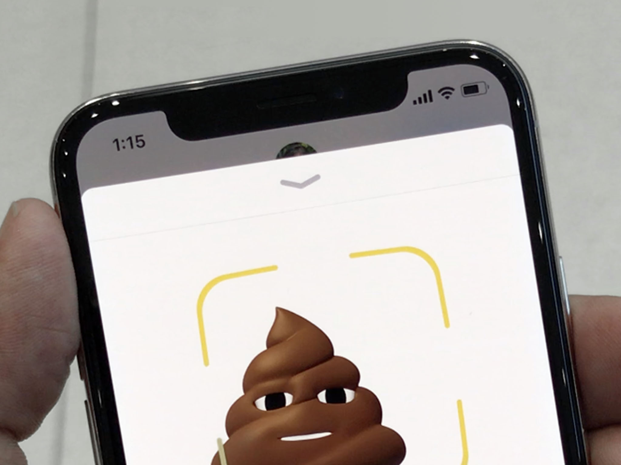

How it works for you for Apple Pay will depend on your existing habits. I use Apple Watch 99% of the time for Apple Pay, so I will notice no practical difference. On the rare occasions I use iPhone for Apple Pay, I've always double clicked the Home button while touching the fingerprint sensor and then tapped the payment terminal. So, for me, double-clicking the Side button while looking at the face sensor and then tapping the payment terminal also makes no practical difference.
If you try tapping first, like you could with Touch ID, the hint system will ask you to double-click the Side button anyway. Yeah. Ugh. Your pay flow will need to change.
But seriously, so far, so great. I'm forgetting that Face ID is even there most of the time until I look and see iPhone X is already unlocked. Even with App Store apps like 1Password, Face ID is so fast it makes Touch ID suddenly seem slow and onerous by comparison.
And I say that as someone who loved Touch ID. Loved it right up until the moment I got Face ID.

Attention-aware interface
The mic was dumb until Siri, then it learned to understand us. The button was dumb until Touch ID, then it learned to know us. The camera was dumb until Face ID, now it's learned to see us. And when it does, it becomes even more personal... and considerate.
Look at iPhone X and private notifications expand, ringers and alarms dim discretely because it knows you're aware of them, and the screen stays lit because it knows you're reading it.
It's a dynamically, contextually aware interface and, combined with Siri and other sensors, it's going to transform how we relate to technology — and how technology relates to us — going forward.
iPhone X Portrait Selfies
The same TrueDepth camera that powers Face ID also provides for front facing Portrait Mode and Portrait Lighting on iPhone X. In other words, Portrait Selfies. They're 7 megapixels and ƒ/2.2, but otherwise use similar technologies as rear-facing cameras have for generations.

Portrait Mode launched with the dual-lens camera system on iPhone 7 Plus and enabled not only 2x optical zoom, but depth-awareness. By comparing the wide angle and telephoto captures, a depth map could be created and effects like Bokeh-style lens blur added. It allows you to get a fancy DSLR look from your phone camera, and it's proven popular and emotionally resonant enough that pretty much every major competitor is now emulating it.
Portrait Lighting launched with the A11 Bionic chipset on iPhone 8. By applying face detection to the depth map data from Portrait Mode, different effects like studio, contour, and stage lighting can be applied. It allows you to get a fancy studio look from your phone.
Still in beta, it's as hit and miss for me on both front and back iPhone X cameras as it is on the iPhone 8 back camera. Especially Stage Lighting. If it improves as rapidly as Portrait Mode did, though, I expect it to be similarly emulated by competing phones next year.

Light it like that: Portrait Lighting is working well for Studio and Contour (left), but Stage and Stage Mono (right) still need careful... staging.
Digital photography was revolutionary. Computational photography, where light and data are just the beginning of the photographic process, is poised to be just as revolutionary.
Importantly, Apple released a "depthy" API as part of iOS 11. Since depth data is crammed into the headers in JPG files and into separate containers in HEIF files, it remains editable. So, you can remove or add back the bokeh, and switch between lighting effects long after you took the photo. Since developers can also support it, you can use it to apply filters and effects in other apps as well. The latest version of Photoshop imports the depth data as a channel so you can touch it or change it any way you like.
What's next, Portrait Backgrounds to get a fancy greenscreen look? No, that's already happening now as well in Apple's Clips app for iPhone X. You can place yourself in 360º animated environments, including in full holographic effect inside the Millennium freaking Falcon. It's amazing.
I'm ridiculously excited about computational photography in general, and its availability on the front-facing camera makes me want to shoot with it all the time.
Google is doing portrait mode on Pixel 2 using dual pixels on a single lens. That approach means the feature can be applied to almost any device of almost any size. Apple, using a depth camera on the front and dual-lens fusion camera on the back, is far more limited in terms of devices and sizes right now. Yet that extra hardware enables extra features, including optical zoom and Face ID.
Both Apple and Google will continue to update their software and machine learning models to make better and better use of their available hardware. But Apple has more available hardware and that's something that simply can't be updated after it ships.
iPhone X Animoji
Separate from Face ID, Apple is making rudimentary mesh, depth data, and tracking available to developers through ARKit, the company's augmented reality framework. It never gets anywhere near the Face ID data contained in the secure neural engine block, or the Face ID process, but it does allow for some incredibly fun effects, like Animoji.
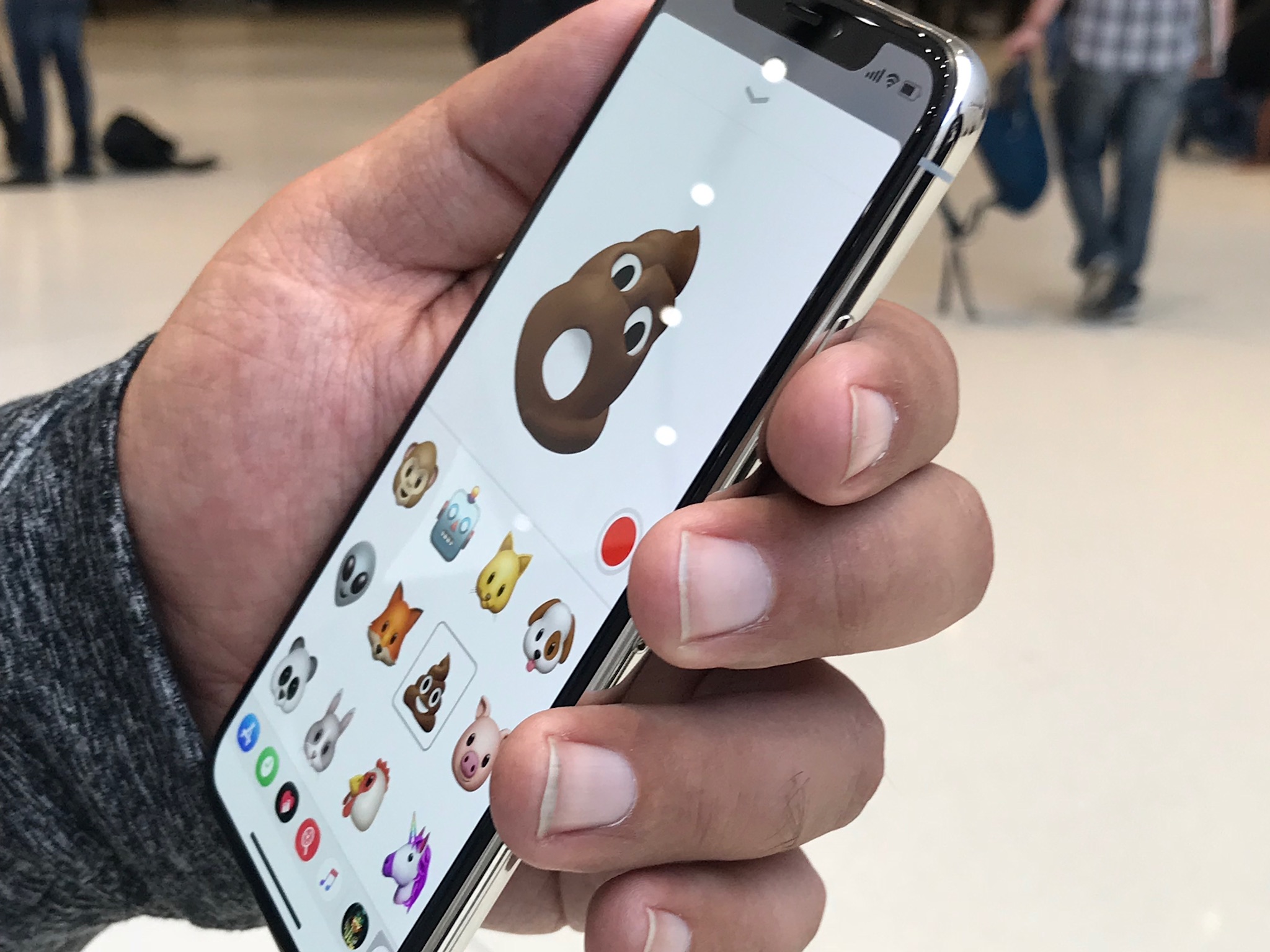
Built into the iPhone X Messages app, Animoji uses the TrueDepth camera to take your head movements, facial expressions, and voice and maps them to animated emoji.
There are only a dozen available right now: Pig, Panda, Rabbit, Cat, Chicken, Unicorn, Alien, Monkey, Robot, Dog, Fox, and... Poo.
Animoji can detect and match 50 different facial expressions quickly enough that it feels real-time. As you move, the Poo (or dog or alien or monkey) moves. Yes, just like that. The effect is so fun at first you forget that you can record them and send them as iMessages. But you can. The recipient gets an animation file, so they don't have to be on iPhone X to watch them. Only to reply.
There's a lot of overhead to Animoji, so if you're just restoring your iPhone X from backup or otherwise taxing its resources, wait or quit some stuff to make sure the tracking stays on point. Also, have plenty of light handy.
As Apple learned with Digital Touch on the original Watch, it's tough to make device-specific features catch on. Mostly, we use them a few times to either feel like part of the exclusive club or show off that we're in it. Then it quickly becomes an occasional, even rare thing.
Still, its a trippy-fun feature for Messages and a great demo for the TrueDepth camera and ARKit's face tracking ability. And right now I'm sending them to absolutely everyone. (Not sorry.)
Especially fun in Animoji Karaoke. It's really more like Animoji lip sync or dub smash, but it's essentially mouthing the lyrics to a song while recording an Animoji, and it's lighting social on fire.
I've also experimented with Animoji Theater.
Again, who knows how long it will last, but right now it's a blast.
iPhone X Dual-lens Camera
iPhone X also has a better dual-lens fusion camera system on the back. The wide angle lens remains the same as iPhone 8: 12 megapixel ƒ/1.8 with optical image stabilization (OIS). The telephoto lens is all new: Still 12 megapixel but now ƒ/2.4 (instead of ƒ/2.8) and with OIS as well.
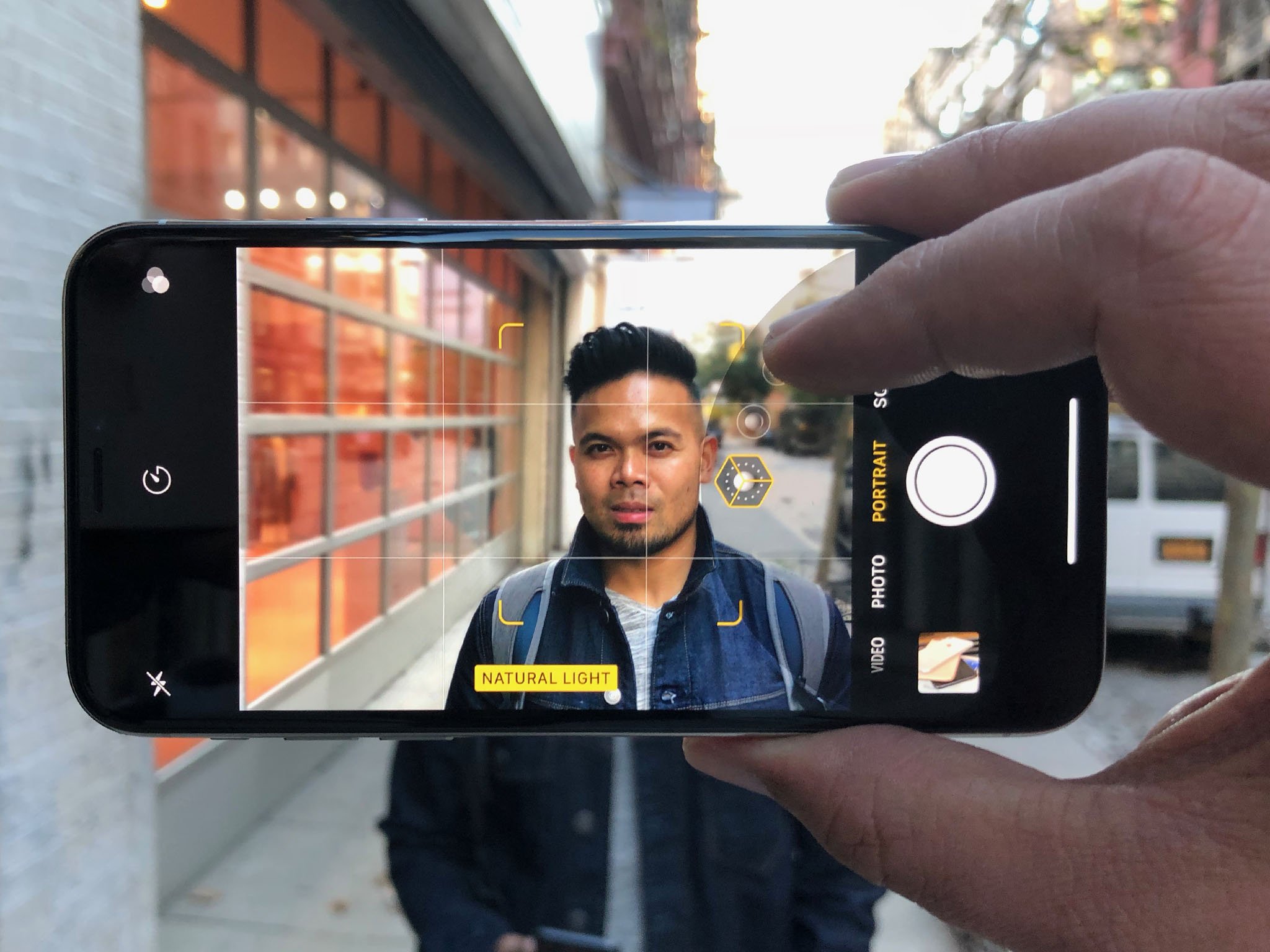
OIS on the telephoto lens uses what Apple says is a state-of-the art seven magnet system. It matters less to me how Apple did. I'm just glad the company did it.
The lenses are arranged vertically on iPhone X instead of horizontally like on iPhone 8 and iPhone 7. My guess is that gets them out completely out of the way of the TrueDepth camera system on the front. The Quad-LED flash is also housed in between the two lenses on iPhone X, as opposed to off to the side on iPhone 8 Plus and iPhone 7 Plus.
And yes, there's still a bump. Apple isn't making iPhone X as thick or as wedge-shaped as competitors, and cameras need depth, so until it can figure out how to fool physics, thin phones need bumps to accommodate good cameras.
Both the higher aperture and optical image stabilization on the telephoto mean iPhone X can capture just a little more light and for just a little longer. It works out to about a third of a stop better.
iPhone 7 was already good at getting images no iPhone could before it. iPhone 8 could get those images with better detail, especially in the details and textures. iPhone X can make sure they're as clear and crisp as possible. Even and especially when you're using the the two-lens optical zoom feature.
The rest of the camera system is the same as iPhone 8, but a lot the new features Apple included in both are worth going over again.
The new camera sensors have "deeper" pixels, which further reduces cross-talk and improves accuracy. They're also larger and faster to pull in more light and let you capture more immediately, so you get the moment you want, not the moment after the moment you want.
There's also a new color filter, which is a rarity these days in the camera world. Apple isn't saying much about it yet, but the company is promising it provides better, truer colors across a wider dynamic range, and with less noise.
The new slow sync flash combines a slow shutter speed with a short probe pulse that better exposes both the subject and the background when and if you need to resort to the flash.
Like I said in my iPhone 8 review, it's the type of feature I never realized I was missing on my iPhone until I used it. Then I wished I could go back in time a retake every extreme low-light photo I've ever taken. It's especially great when using Portrait Mode in low light and indoors.
Apple's new ISP (image signal processor) does all the usual auto-white balance, auto-focus, and auto-exposure, but also analyzes the scene for lighting, people, motion, and other elements and continuously optimizes for capture. It also does auto-HDR (high dynamic range) now. So, photos show an amazing amount of detail in both light and shadow.
They also show amazing textures. Apple is using a hardware accelerated multi-band noise reduction system right on the ISP. But it's also using machine learning to go back and restore detail in skies, fabrics, hair, and other textures. That way it doesn't get lost to noise reduction or interfered with by compression patterns. It just looks great.
Beyond textures, the machine learning models also detects things like concerts, which are traditionally hard to resolve, and figures out the background while focusing on the action. Snow and ice, too, so rather than massive blowouts you get detail in the frozen landscapes without losing your subjects to shadow.
Portrait Mode and Portrait Lighting are both present, like on Phone 8 Plus, but being able to do them on the more iPhone 8-sized iPhone X is terrific.
Some of the fancy new photo stuff is thanks to HEIF, the high-efficiency image file format Apple switched to in iOS 11 and provides hardware acceleration for in the A11 Bionic chipset. HEIF lets Apple store the depth map as separate data within the same container. It also lets Apple store Live Photo data the same way, including the new, non-destructive Live Photo effects like Bounce, Loop, and Long Exposure.
iPhone X similarly benefits from HEVC, the high-efficiency video codec also known as H.265. Thanks to HEVC and the A11 Bionic, iPhone X can capture and encode 4K at 60 FPS. It can also do 1080p Slo-Mo at 240 FPS. These simply aren't features you expect to see on prosumer video cameras, much less "phones".
To make the video look as good as possible, the ISP is doing predictive analysis on the video at a granularity of 2 million tiles per frame for the same kind of elements as is does for photos, including skies, textures, and motion, and then optimizing the compression to preserve as much detail as possible.
When it comes to augmented reality (AR), Apple claims it's tuned the cameras for the best experience possible as well as improved the internal gyroscope and accelerometer specifically for AR.
It's especially great on iPhone X because of the edge-to-edge display. And it's where Apple's decision to go as close to edge-to-edge as possible really pays off.
Aside from the TrueDepth camera module, there's almost no bezel to separate the augmented from the reality. In portrait, you do get that cutout. In landscape, though, my thumb falls there and it's as close to a transparent phone as I've ever seen. Even a small bezel straight across the top would have ended up being much more noticeable.
The result is that, even more than previous iPhones, you feel like you're looking through a lens or a portal into a world where digital is made manifest. A world where you can swipe and pinch furniture, drop castles on your coffee table, build a rocket on your deck, and walk into entirely new dimensions.
We're at the very, very beginning of consumer AR but iPhone X has already taken it on step further.
iPhone X Battery Life
Battery life is the currency of mobile. Everything you do costs battery life. At the heart of battery life is the processor. And at the heart of iPhone X battery life is Apple's A11 Bionic.

Last year it was A10 Fusion system-on-a-chip (SoC) with its paired performance.EFFICIENCY cores. This year it's A11 Bionic — as in the Six Million Dollar Man and Woman (ask your parents) — with its independent performance.EFFICIENCY cores and Neural Engine block.
A11 Bionic is the science that's responsible for a lot of magic in iPhone X. Instead of last year's four cores, two efficiency cores paired with two performance cores, it now has six, two performance and four efficiency. The performance cores are up to 25 percent faster than A10 and the efficiency cores are up to 70 percent faster. Importantly, Instead of being paired, all six cores can be addressed at the same time for some impressively massive parallelism. Enough that A11 Bionic is benchmarking like a MacBook Pro. Without a fan. And in the palm of your hand.
For the first time, Apple is also doing its own, fully custom, three core graphics processor. It lets iPhone X render highly detailed, highly textured models to put into the CPU-tracked 3D space of ARKit.
Also new this year is the Neural Engine block, which accelerates Core ML, the machine learning framework that's increasingly touching so much of Apple's experiences.
Machine Learning is what I like to think of as Tinder for computers. Yes. No. Yes. Yes. No. No. No.
Instead of coding the machine you're training it. Almost like a pet. Which is amazing. And terrifying.
Integrating Artificial Intelligence at the chipset level is something Apple started working on over three years ago. That's roughly a year before a weird narrative started spreading in the media and on social that Apple was behind when it came to AI. Go figure.
Apple's now using it everywhere, from machine learning models to computer vision to natural language. It can pre-sort data, find objects in images, parse speech, even optimize battery life based on your usage patterns.
It's one of the ways Apple is shrinking an iPhone Plus sized screen into a regular iPhone sized casing but keeping the Plus sized battery life.
In my quick tests, which, yes, involves hitting it with screen, GPS, cellular, and Bluetooth the way only Pokémon Go can, it seems to drain at a rate much more like an iPhone 8 Plus than an iPhone 8. But I'll keep testing it in the weeks and months ahead and update accordingly.
As I mentioned in my iPhone 8 review, though, Apple's long-standing practice of keeping battery life the same while using improvements in efficiency to offer more features or smaller, lighter, easier to handle devices, may need reevaluating.
Lightness is absolutely key to usability — if you can't hold up your phone for long periods of time to read a book, play a game or watch a movie, that extra battery life doesn't help you much — but we're long past the era where light web browsing and checking email, watching video or listening to audio, were the baseline behaviors.
We're now in the era of augmented reality and social media, where Twitter, Facebook, Snapchat, Instagram, and growing number of games like Pokémon Go are downloading photos and video, lighting up the display, and pulling location data constantly as we go.
Yes, batteries are insulators, which increase heat, and they're not RF transparent, which makes radios a challenge, and you can't just pipe more in like tasty custard filling.
But, absent breakthroughs in solid-state batteries or other new technologies, increasing battery life to better meet the demands of modern apps is something Apple and its control over the entire widget is uniquely positioned to address.
It may be as simple as moving to iPhone X designs across the board and releasing Smart Battery Cases for them. That way, people could have the light, easy to manage cores for regular use and slap on an extended battery for heavy use situations. Best of both worlds.
Because the company already has the power part nailed. A11 Bionic lets me do all the cool new things like computational photography and augmented reality — things that pegged A10 — with headroom to spare.
I've run out of superlatives for how ludicrously, ridiculously fast these chipsets are. No one else in the industry is doing silicon this interesting or impressive.
iPhone X Radios
As much as iPhone X is a camera and gateway to augmented reality, it's also an internet communicator and a phone. The ability to connect to networks and, ultimately, people is still critically important.

For Wi-Fi, iPhone X offers 802.11ac with multi-in, multi-out (MIMO), which is what we've expected and gotten from all recent iPhones.
Bluetooth, though, jumps to 5.0. Theoretically, we should see improvements in both efficiency and reliability, but Bluetooth always feels like such a broken technology and has to maintain so much legacy compatibility that I've learned not to expect miracles.
At this point, I'm much more excited about supersets of BT, like what Apple is doing with the W1 and W2 chips in AirPods and Apple Watch Series 3, if not an entirely new protocol at some point.
And yes, I am worried about proprietary silos, but people need their increasingly connected accessories — including HomeKit and HealthKit from Apple — to be beyond rock solid.
GPS (U.S.) and GLONASS (Russian) positioning systems are being augmented this year by Galileo (EU) and QZSS (Japan). In theory, it should allow for better location services in more places around the world.
I have had some issues with location services on iPhone 8, though. Low power mode has interrupted location updates, and wake-from-sleep has caused some jumping around. I don't know if Apple is being overly aggressive on power management or if there's some other issue at work.
I haven't had that problem yet on iPhone X but I also haven't been using it for a month yet. I will be continuing to investigate it on both devices.
NFC for Apple Pay remains the same and, with iOS 11, developers can read (but not write) through NFC as well now.
For cellular, Apple is offering LTE Advanced but not yet gigabit. That's likely because iPhone dual-sources modems from Qualcomm (for CDMA compatibility with Verizon and Sprint) and Intel (which bought original iPhone modem maker, Infineon). And Qualcomm has been leading the way in gigabit.
Apple has also always been conservative when it comes to radio technology and willing to wait for subsequent generation chipsets that offered better balances of performance and power efficiency. Famously, the company didn't offer 3G in the original iPhone nor LTE until iPhone 5.
The Qualcomm model (A1865) supports:
- FDD-LTE (Bands 1, 2, 3, 4, 5, 7, 8, 12, 13, 17, 18, 19, 20, 25, 26, 28, 29, 30, 66)
- TD-LTE (Bands 34, 38, 39, 40, 41)
- TD-SCDMA 1900 (F), 2000 (A)
- CDMA EV-DO Rev. A (800, 1900, 2100 MHz)
- UMTS/HSPA+/DC-HSDPA (850, 900, 1700/2100, 1900, 2100 MHz)
- GSM/EDGE (850, 900, 1800, 1900 MHz)
The Intel model (A1901) supports:
- FDD-LTE (Bands 1, 2, 3, 4, 5, 7, 8, 12, 13, 17, 18, 19, 20, 25, 26, 28, 29, 30, 66)
- TD-LTE (Bands 34, 38, 39, 40, 41)
- UMTS/HSPA+/DC-HSDPA (850, 900, 1700/2100, 1900, 2100 MHz)
- GSM/EDGE (850, 900, 1800, 1900 MHz)
There's a lot of litigation in the cellular modem space right now. Enough to make me wonder when Apple might start fielding its own. We've already seen what custom Apple silicon can do for everything from processors to controllers to wireless.
And there are a lot of letters left in the alphabet.
In terms of real-world performance, while roaming on both AT&T and T-Mobile in the U.S., data and voice have performed consistently well. I used it for a a radio interview right after I got it and the notoriously can't-you-get-a-landline producers at the CBC said I sounded great.
I haven't had a chance to try Enhanced Voice Services, which some carriers are rolling out to make calls sound even better and more natural, but I look forward to testing it at some point.
And, of course, iPhone X works terrifically well with AirPods.
iPhone X Wireless Charging
Wireless — in this case, inductive — charging on iPhone X is functionally the same as it is on iPhone 8. I've never been a huge fan of it. I've had it on phones since my Palm Pre in 2009 and on one Android phone or another over the years. Most recently, I've been using it since it launched with iPhone 8. And it's growing on me.

Rather than having to reach for and find the end of a Lightning cable, and fumble with getting it into the Lightning port, you can simply drop your iPhone X down on the pad and it'll start charging. Mostly.
My experience is that every once and awhile, it'll miss the sweet spot and not notice or it'll get somehow jostled off at some point and simply not charge. Some of it seems to depend on the exact charging pad you're using — I've had the most luck with mophie.
It's still not as efficient as wired charging. The current Qi implementation feels about as fast as using the tiny square brick that comes with iPhone X. Meanwhile, wired charging with an iPad brick is significantly faster and, and getting faster still with an iPad USB-C brick — up to 50% in 30 minutes.
Even so, setting up a Qi pad on the table next to your bed or the desk where you work is nice. When you're tired or busy — as long as you make sure the connection takes — it's super nice.
I don't have a car with a Qi pad nor do any of the restaurants or coffee shops near me have Qi tables. As that grows, it'll become downright pleasant.
Apple pushing Qi could and should help with that. There's nothing like flooding a market with tens and eventually hundreds of millions of implementations to get supporting industries to take notice. When every Starbucks, McDonald's, Aloft, and Lyft has one, the value will be astronomically higher.
Apple super-setting Qi, the way the company is already doing with its AirPower pad, coming next year, could and hopefully will result in the technology improving faster. As long as the pad/pod is on the table or desk, I should be able to drop my iPhone anywhere within a few inches and have it just charge, sweet spot be damned.
AirPower will charge either an iPhone, Apple Watch Series 3, and AirPods (with an upcoming and sold-separately new charging case), or up to two iPhones and a Watch or AirPods. It's already an example of Apple super-setting Q, and hopefully just the first.
iPhone X Accessories and Apps
iPhone X marks a significant design change from every iPhone that's come before it. That includes size, shape, and even previously iconic features like the Home button. Accessories designed to fit previous iPhones, including and especially cases and screen protectors, won't fit iPhone X.
Other accessories, including adjustable mounts, inductive charging pads, and anything that works over Wi-Fi or Bluetooth will be just fine.
- Best iPhone X accessories
- Best iPhone X cases
- Best wireless charging pads for iPhone X
- Best screen protectors for iPhone X
- Best car mounts for iPhone X
Since X runs iOS 11, it's compatible with all the millions of apps in the newly redesigned iPhone App Store. That includes all the apps from Google, Microsoft, Facebook and Instagram, Twitter and all the games you could imagine. If you're coming from either Android or Windows Phone, you'll feel right at home.
There's also a whole slew of augmented reality (AR) apps that are especially great on iPhone X.
While any iPhone app will work on iPhone X, developers can update their apps to better fit the iPhone X display and navigation paradigm. The more engaged indie app developers are already doing that. Others may take longer.
IPhone X, despite its size, also presents like an iPhone, not an iPhone Plus. So you don't get the iPad-style interfaces in landscape and some the of the other expanded views.
As someone who's used an iPhone Plus consistently since Apple introduced iPhone 6 Plus in 2014, I miss them. The different aspect ratio of iPhone X would make some of them less useful and even a challenge, but I hope Apple considers at least a hybrid approach in a future update.
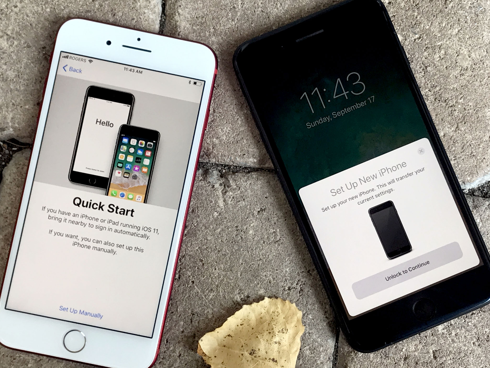
iOS 11
iPhone X ships with iOS 11.03. By the time it arrives, though, you'll be able to immediately update it to iOS 11.1, the latest update to Apple's latest generation multitouch operating system, and its hundreds of new emoji. (You know that's what makes you update.) iOS 11 will even let you set up your iPhone X simply by placing it next to your old iPhone.
iPhone X Pricing and Availability
iPhone X is available for order now starting at $999 for the 64 GB version, or $1149 for the 256 GB version. If you stream everything and keep your photos online, you might be fine with 64 GB. If you want all your media on your device, go for 256 GB.

And yes, this is the highest price Apple has ever charged for an iPhone. It's also the most Apple has spent producing a phone, especially with new components like TrueDepth, expensive components like the OLED Display, and currently constrained components like memory chips.
Like with the new 12-inch MacBook, you can get tomorrow's technology today, but it comes at a price.
Still, according to a recent Twitter poll I conducted, over half the people who responded were getting iPhone X and, in a separate poll, around half were getting the most expensive 256 GB models.
I don't think it's good for consumers if the base price for iPhone trends up. But I do think it's great for futurists and technologists if Apple occasionally makes iPhones that aren't bound to the base prices.
iPhone X is available as of November 3, 2017, in Andorra, Australia, Austria, Bahrain, Belgium, Bulgaria, Canada, China, Croatia, Cyprus, Czech Republic, Denmark, Estonia, Finland, France, Germany, Greece, Greenland, Guernsey, Hong Kong, Hungary, Iceland, India, Ireland, Isle of Man, Italy, Japan, Jersey, Kuwait, Latvia, Liechtenstein, Lithuania, Luxembourg, Malta, Mexico, Monaco, Netherlands, New Zealand, Norway, Poland, Portugal, Puerto Rico, Qatar, Romania, Russia, Saudi Arabia, Singapore, Slovakia, Slovenia, Spain, Sweden, Switzerland, Taiwan, UAE, the UK, the US, and US Virgin Islands.
Update: Your wait is over America. As of December 4, 2017, iPhone X is available SIM-unlocked directly from Apple.
iPhone X is available as of November 24, 2017, in Albania, Bosnia, Cambodia, Isreal, Kosovo, Macau, Macedonia, Malaysia, Montenegro, Serbia, South Africa, South Korea, Thailand, and Turkey.
In many regions, with iPhone X comes Apple Stores and AppleCare. For the last couple of years, Apple has been redoing the stores with better Genius support, new Creative Pros to help with non-technical support, and Apple Today as a hub for education and arts. There are all sorts of free classes, workshops, photo walks, and more. So much so, that it's impossible to accurately convey the true value of iPhone without considering the Apple Stores that come with them.
Standard Apple Care covers you against the usual issues for a year. Apple Care+, which costs a higher-than-usual $199 for iPhone X, covers you for two years, including up to two $29 screen or $99 water/other repairs/replacements.
If, like me, you're not always as careful with your technology as you should be, then you, like me, might extract significant value from AppleCare+ over the course of a couple years.
iPhone X Conclusion
iPhone X is new. It's different. And when you have hundreds of millions of people used to the way things are, some of them won't appreciate or simply won't yet be ready for the new and different. That's why Apple is also offering iPhone 8, which has several of the new features in a design that's not so different at all.
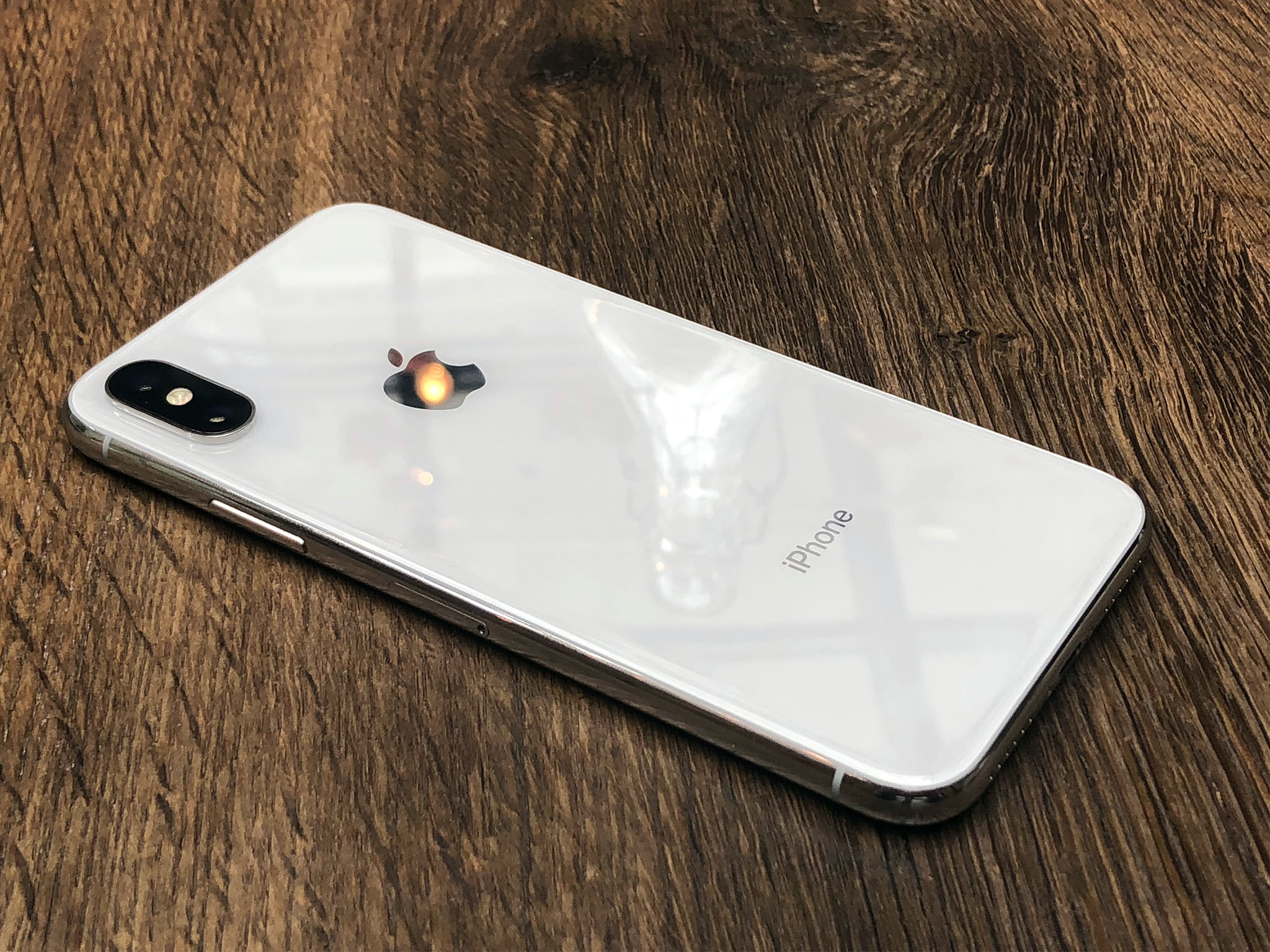
If you love everything about your existing iPhone, including the Home button and Touch ID, and you just want it to be faster, with better cameras and conveniences like inductive charging, let other people wait to test drive the radically new. See what they say, come back next year for the next generation — by which point the new will no longer be quite so radical — and, in the meantime, get an iPhone 8.
If you're ready for something new, including an almost edge-to-edge OLED display with TrueTone and HDR, a TrueDepth camera that gives you Portrait selfies, face tracking and Animoji, and Face ID facial identity scanning, an optically stabilized telephoto lens on back, and a new gesture navigation system on front, then get your order in as soon as you can for iPhone X.
It's expensive. It's hard to get. It will take some getting used to. And it'll have its share of quirks. But it's not just tomorrow's iPhone today and it's not just the beginning of what comes next. It's the best damn product Apple has ever made.
And it's the most fun I've had with any device since the original iPhone.
IPHONE 10 FEATURE , IPHONE 10PRICE






0 comments: